![logo-horizontal_w.png]](https://support.tiled.co/hs-fs/hubfs/logo-horizontal_w.png?height=30&name=logo-horizontal_w.png)
Overview
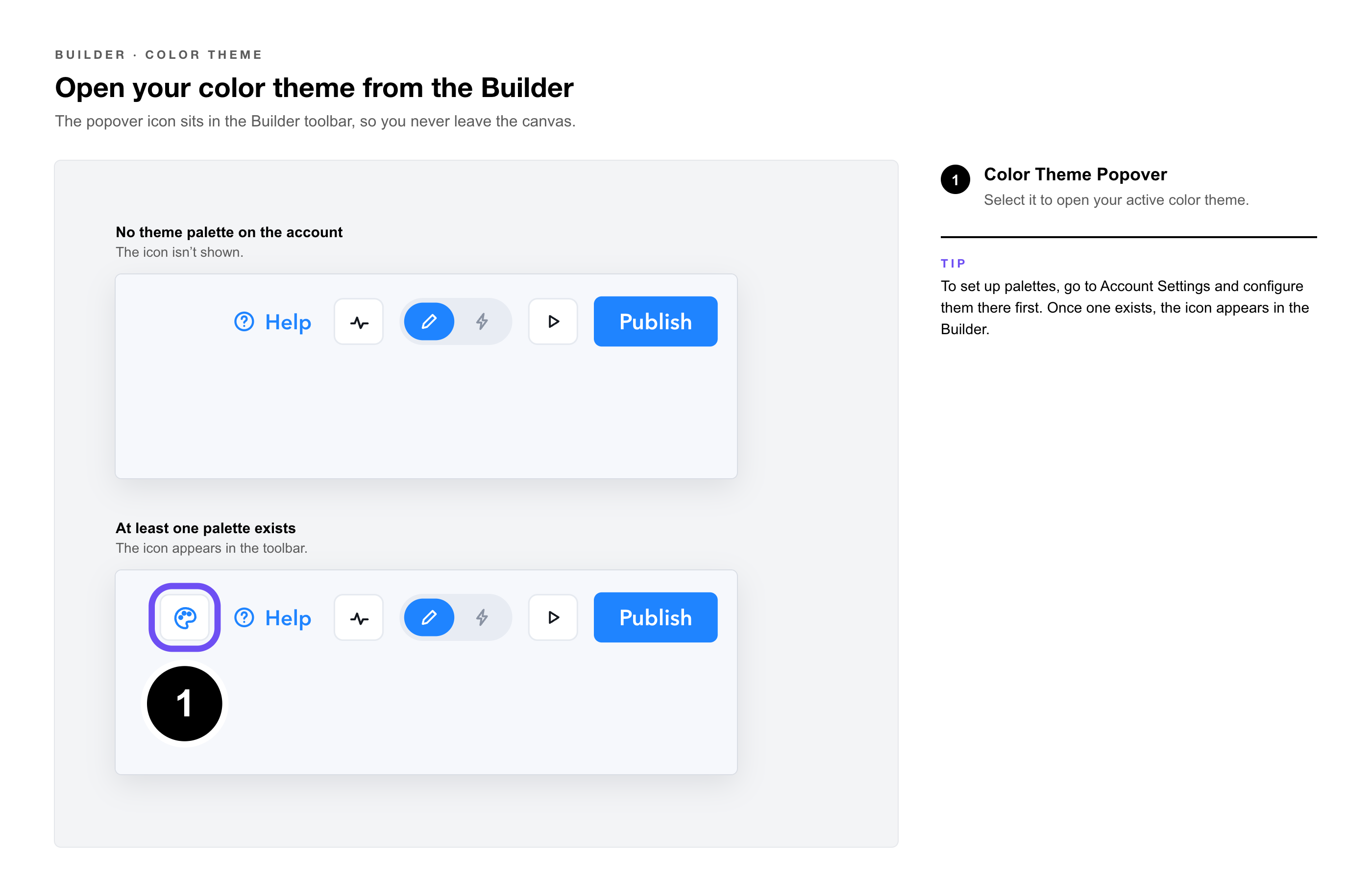
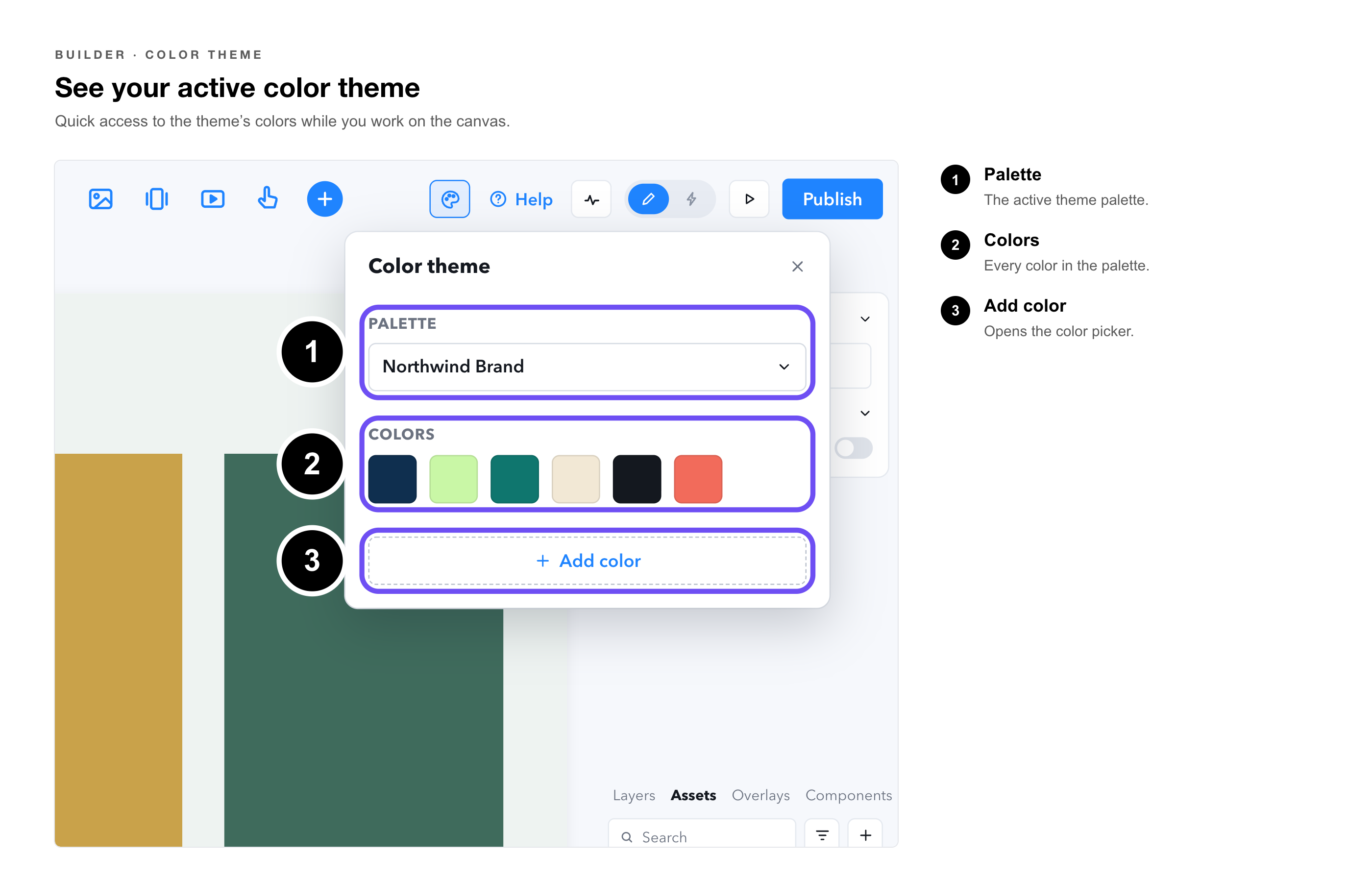
A new Color Theme Popover gives editors quick access to their color theme while working in the Builder, without leaving the canvas to go to Settings. The popover surfaces only when at least one theme palette already exists on the account.
What the Popover Does
|
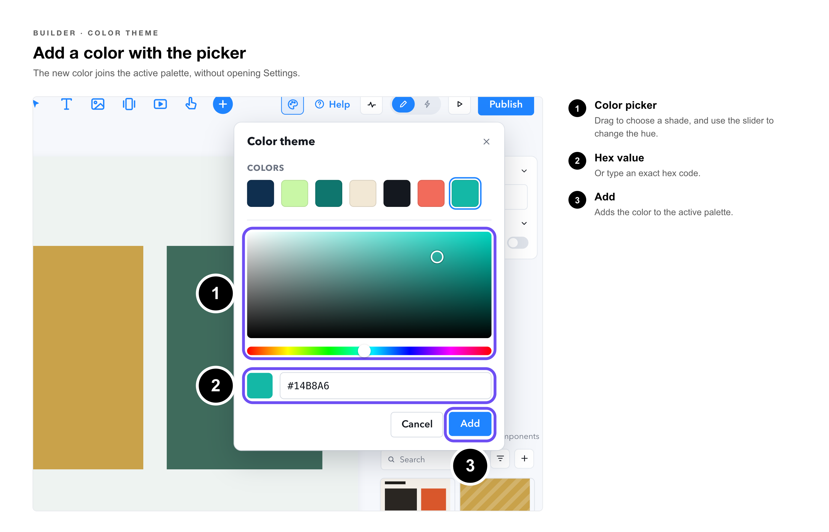
Add a color via picker |
Add a new color to the active palette directly from the popover using the color picker, without opening Settings. |
|
Scoped to existing palettes |
The popover appears only when at least one theme palette exists. If no palettes are configured, the popover icon is not shown. |
How to Access It
The Color Theme Popover icon appears in the Builder toolbar and Microapp settings when a theme palette is configured on the account. Select the icon to open the popover.
|
Tip: To set up color theme palettes, go to Account Settings and configure your palettes there first. Once at least one palette exists, the popover icon appears in the Builder. |