![logo-horizontal_w.png]](https://support.tiled.co/hs-fs/hubfs/logo-horizontal_w.png?height=30&name=logo-horizontal_w.png)
Overview
The Shape Tile adds geometric shapes, lines, and arrows to a microapp page. Shapes support the same appearance controls as other tile types, plus hover effects and click actions, making them useful as visual accents, dividers, callout borders, or interactive elements in their own right.
Adding a Shape1. In the Builder toolbar, select Shapes.
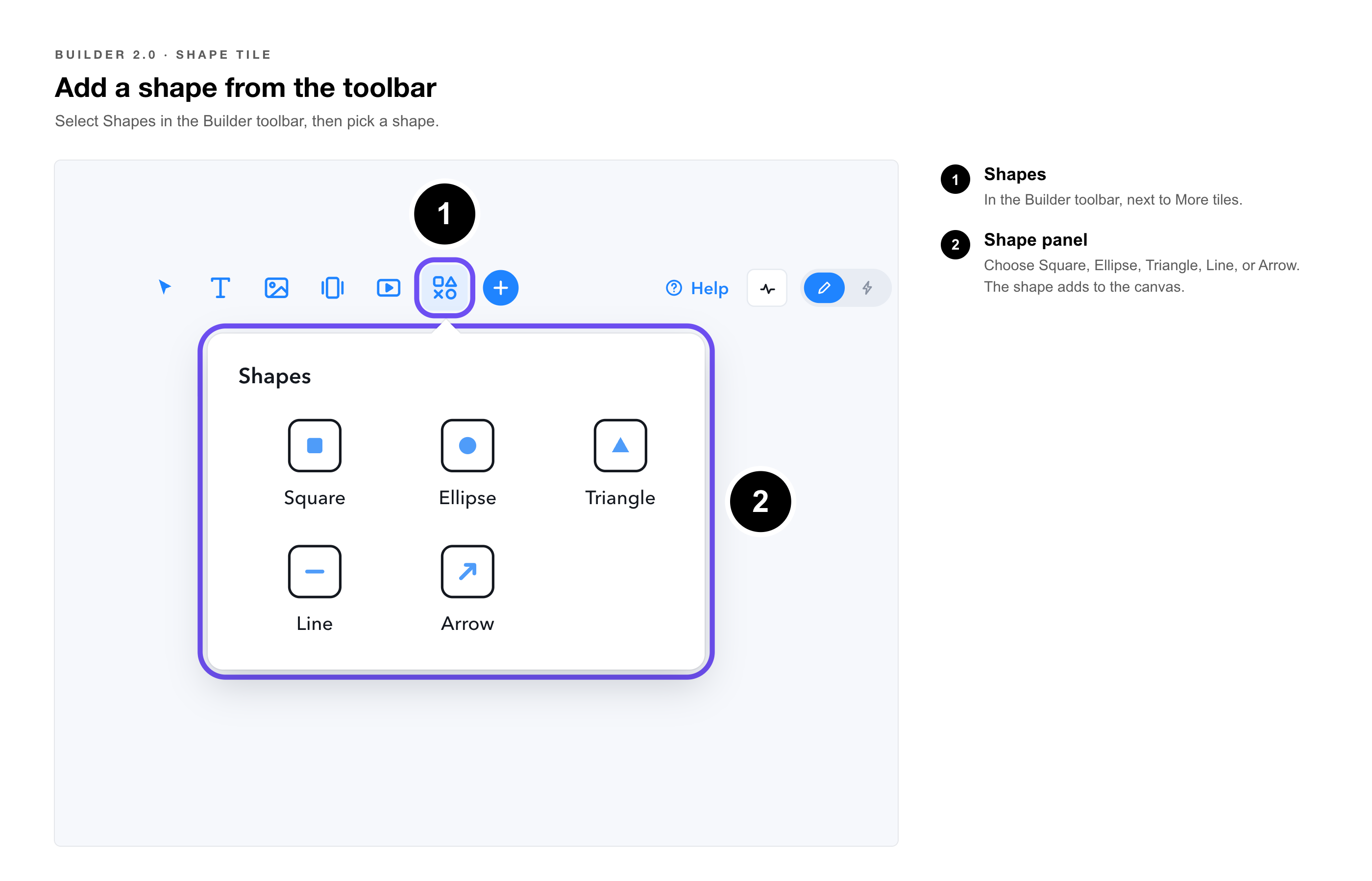
2. Choose a shape type from the panel: Square, Ellipse, Triangle, Line, or Arrow.
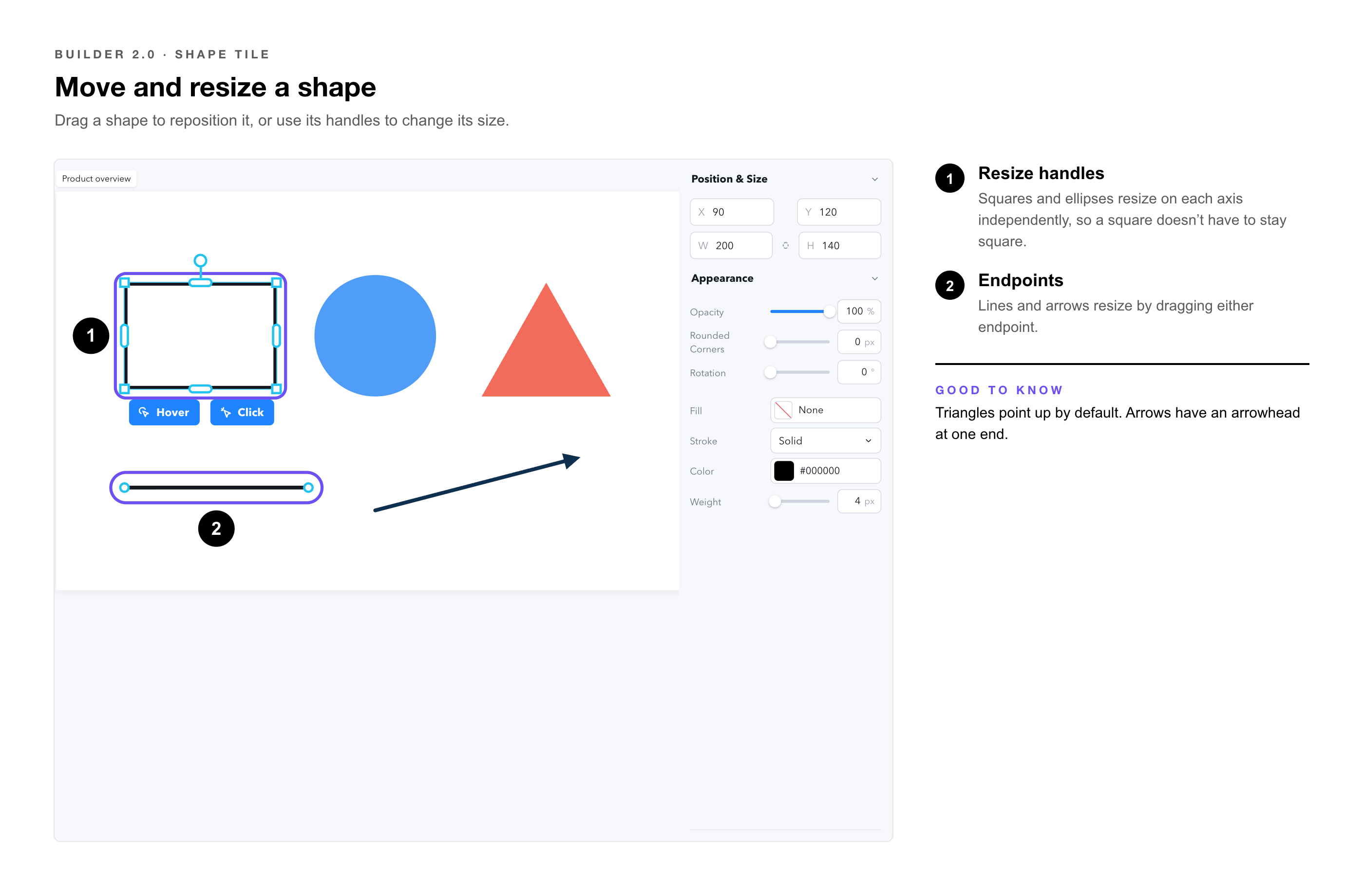
3. The shape adds to the canvas. Drag to reposition, or use the resize handles to adjust its size.
Available Shapes
|
Square |
A rectangular shape. Resizes independently on each axis; does not need to remain a perfect square. |
|
Ellipse |
A circular or oval shape. Resizes independently on each axis. |
|
Triangle |
A triangular shape, point up by default. |
|
Line |
A straight line between two points. Resizes by dragging either endpoint. |
|
Arrow |
A line with an arrowhead at one end. Resizes the same way as a line. |
Position & Size
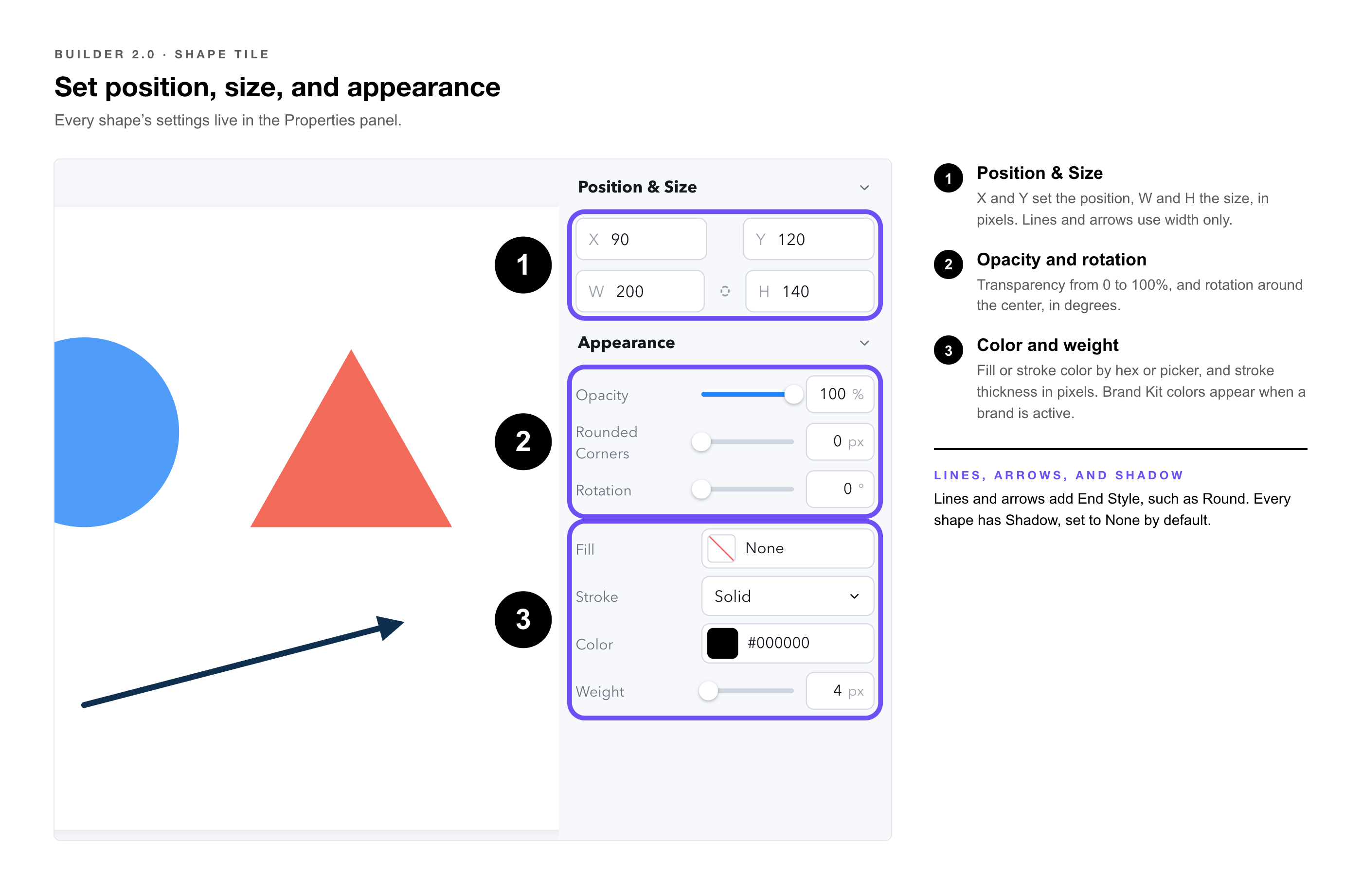
Every shape has standard position and sizing controls in the Properties Panel:
|
X / Y |
The shape's horizontal and vertical position on the page, in pixels. |
|
W / H |
The shape's width and height, in pixels. Line and Arrow shapes use width only, since their height is defined by the angle between endpoints. |
Appearance
The Appearance section controls how the shape looks:
|
Opacity |
Shape transparency, from 0 to 100%. |
|
Rotation |
Rotates the shape around its center, in degrees. |
|
Color |
The shape's stroke or fill color, set by hex value or color picker. Brand Kit colors are available here when a brand is active. |
|
Weight |
The stroke thickness, in pixels. |
|
End Style |
For Line and Arrow shapes, controls how the line ends: Round or other available cap styles. |
|
Shadow |
Adds a drop shadow to the shape. Set to None by default. |
Hover Effects
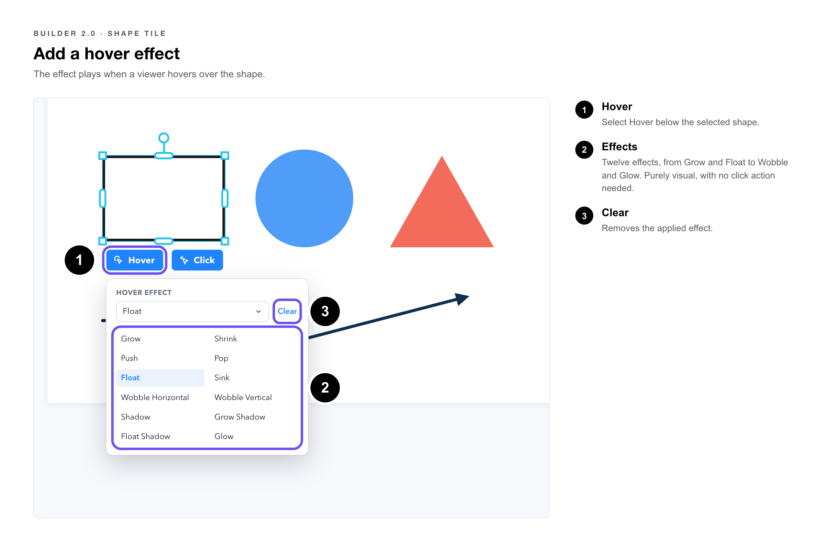
Any shape can have a hover effect applied. When a viewer hovers over the shape, the selected effect plays. Select Hover on the shape's toolbar to choose an effect.
|
Grow |
Shrink |
Push |
|
Pop |
Float |
Sink |
|
Wobble Horizontal |
Wobble Vertical |
Shadow |
|
Grow Shadow |
Float Shadow |
Glow |
Twelve hover effects are available in total. Effects are purely visual and do not require any click action to be configured. Use Clear, next to the Hover effect dropdown, to remove an applied effect.
Click Actions
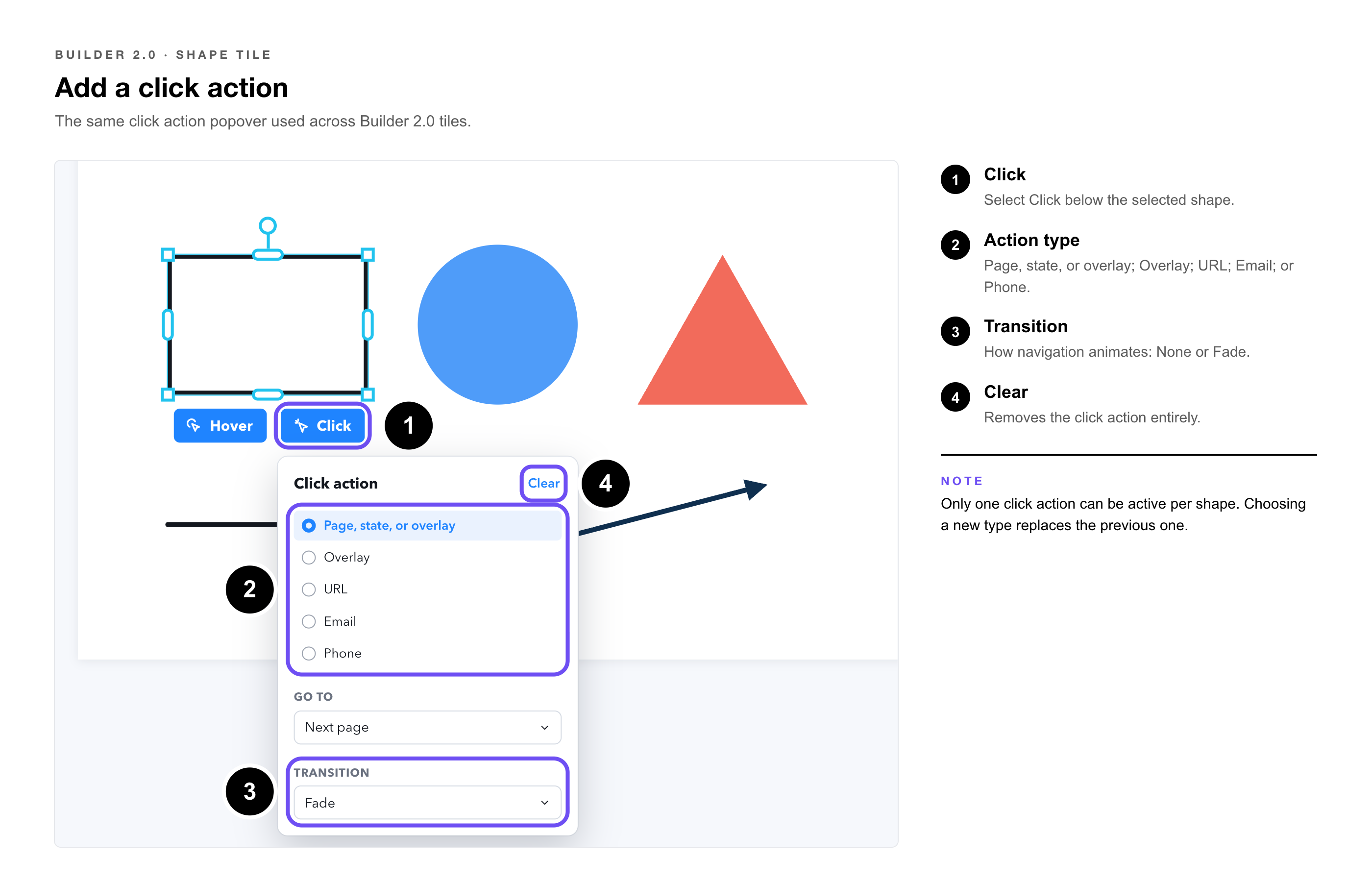
A shape can also be configured to respond to a click, using the same click action popover used across Builder 2.0 tiles. Select Click on the shape's toolbar to configure the action.
Available Click Actions
|
Page, State, or Overlay |
Navigate to a specific page, state, or overlay within the microapp. Options include jumping to a specific page, the next page, the previous page, or the last page viewed. A Transition dropdown sets how the navigation animates: None or Fade. |
|
Overlay |
Open an overlay. Search existing overlays or create a new one directly from the popover. |
|
URL |
Navigate to an external URL. When the microapp is viewed in the Tiled mobile app, choose whether the link opens in-app or in an external browser. |
|
|
Open an email compose window addressed to a specified email address. |
|
Phone |
Initiate a phone call to a specified number, on devices that support it. |
|
Note: Only one click action can be active per shape at a time. Selecting a new action type replaces the previous one. Use Clear, in the top right of the popover, to remove the click action entirely. |
Editing Multiple Shapes at Once
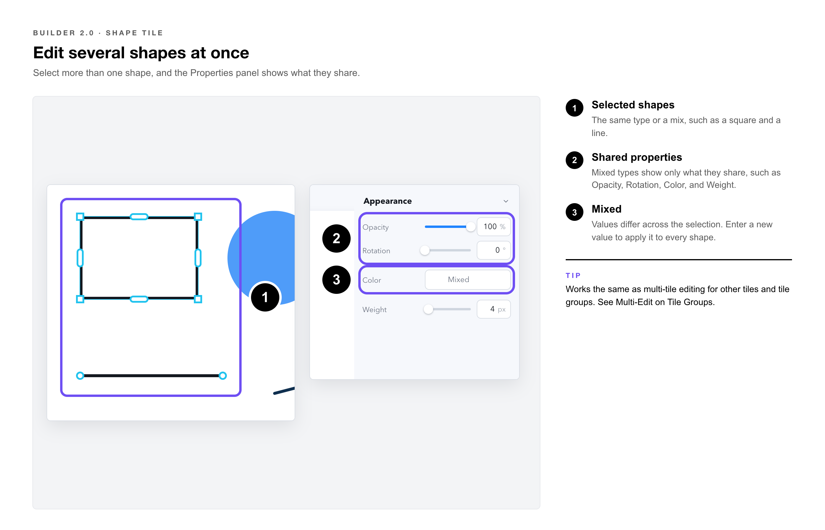
Shape Tiles support multi-tile editing. Select more than one shape, whether the same type or a mix of shapes, and the Properties Panel shows the properties they share. Edit a shared property once and the change applies to every selected shape.
|
Same shape type |
Selecting multiple shapes of the same type (for example, several squares) exposes every property for that shape type. |
|
Mixed shape types |
Selecting different shape types (for example, a square and a line) exposes only the properties they have in common, such as Opacity, Rotation, Color, and Weight. |
|
Mixed values |
When selected shapes have different values for the same property, the field shows Mixed. Entering a new value applies it to every selected shape. |
|
Tip: This works the same way as multi-tile editing for other tile types, and the same way as selecting a tile group. See Multi-Edit on Tile Groups for more detail. |