![logo-horizontal_w.png]](https://support.tiled.co/hs-fs/hubfs/logo-horizontal_w.png?height=30&name=logo-horizontal_w.png)
The Tiled Library is the central hub for your microapps. The Tiled Library is composed of the following sections:
- Tiled Global Navigation
- Tiled Library Navigation
- Header Image
- Microapp Organization
- Tiled Library
- Mobile Tiled Library (Tiled App Only)
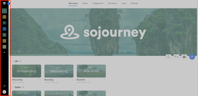
Tiled Global Navigation
The Global navigation is a sidebar which allows you to to hop between microapp libraries. The bottom left side of the navigation is where you can access the Account Settings and User Profile Settings.
Navigation Options
- Tiled Icon - Clicking the Tiled Icon will always take you to the Microapp Library
- Libraries - Click a Library image to navigate to a new library.
- Account Settings
- User Profile Settings
Tiled Library Navigation
The Library navigation allows you to access different features of the Tiled application. This navigation bar can be accessed from all Tiled pages, except within the microapp builder.
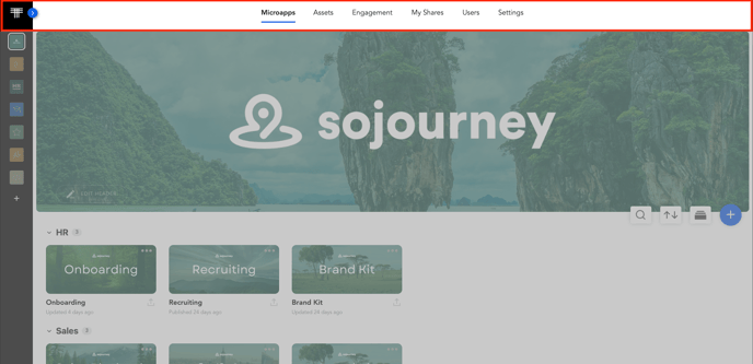
Navigation Options
- Microapps - Microapp Library
- Assets - Asset Library
- Engagement - Engagement Analytics
- My Shares - Personal Analytics on Share Links
- Users - User Management for a specific Library.
- Library Settings - Displays a dropdown of account options based on your permissions. If you are an Admin of Tiled, you will have access to Account Settings here.
Add a Header Image
Header Dimensions
The recommended size for the header image is 1920x1080.
If you are an Admin user, Tiled allows you to customize the header in the Tiled application. Customizing your header is a great way to communicate your company’s brand to your users with a Tiled Account.
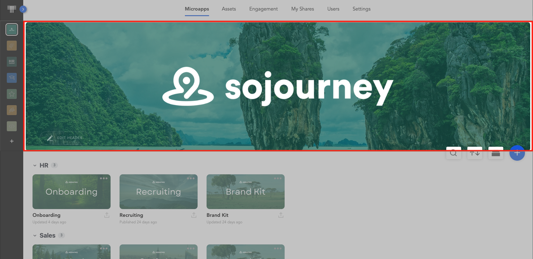 Click the Edit Header button to access the controls allowing you to edit your header. When finished click the Done button. The image is then updated for all the members of your group.
By default, the banner displays the Account Name of your Tiled account.
To edit the header image or name click the "Edit Header" button.
Upload an image
To upload an image, click the Image button and drag and drop an image file from your computer to the browser window. The image file can be a .jpg, .png, or .gif file.
Change the overlay
To change the overlay of your banner image, click the Overlay button and move the slider bar to modify the level of transparency of the image.
Blur the image
To blur your banner image, click the Blur button and move the slider bar to blur or sharpen the image as you desire.
Microapp Organization
Keeping the microapp Library organized is important for your team to quickly and easily find microapps they are searching for.
Search for microapps
Using the Tiled Search feature, you can find microapp titles that match your search.
- Account Admins will search across all libraries.
- Library Admins and Bas Users will be able to search across the libraries they have permissions to.
For more information read about searching for microapps.
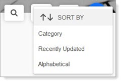
Sort your microapps
The Tiled Sorting feature allows you to sort your microapps by category, by date updated, or alpha-numerically. Click the sort icon and select the desired sort from the drop-down list.
The Tiled Library organizes the microapps as specified.
Organize microapps into Categories
Clicking the Category icon opens the Edit Categories function.
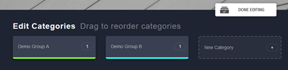
This allows you to create categories for your microapps. For more information about how to best use Categories, see Creating and Managing Microapp Categories.
Microapp Library
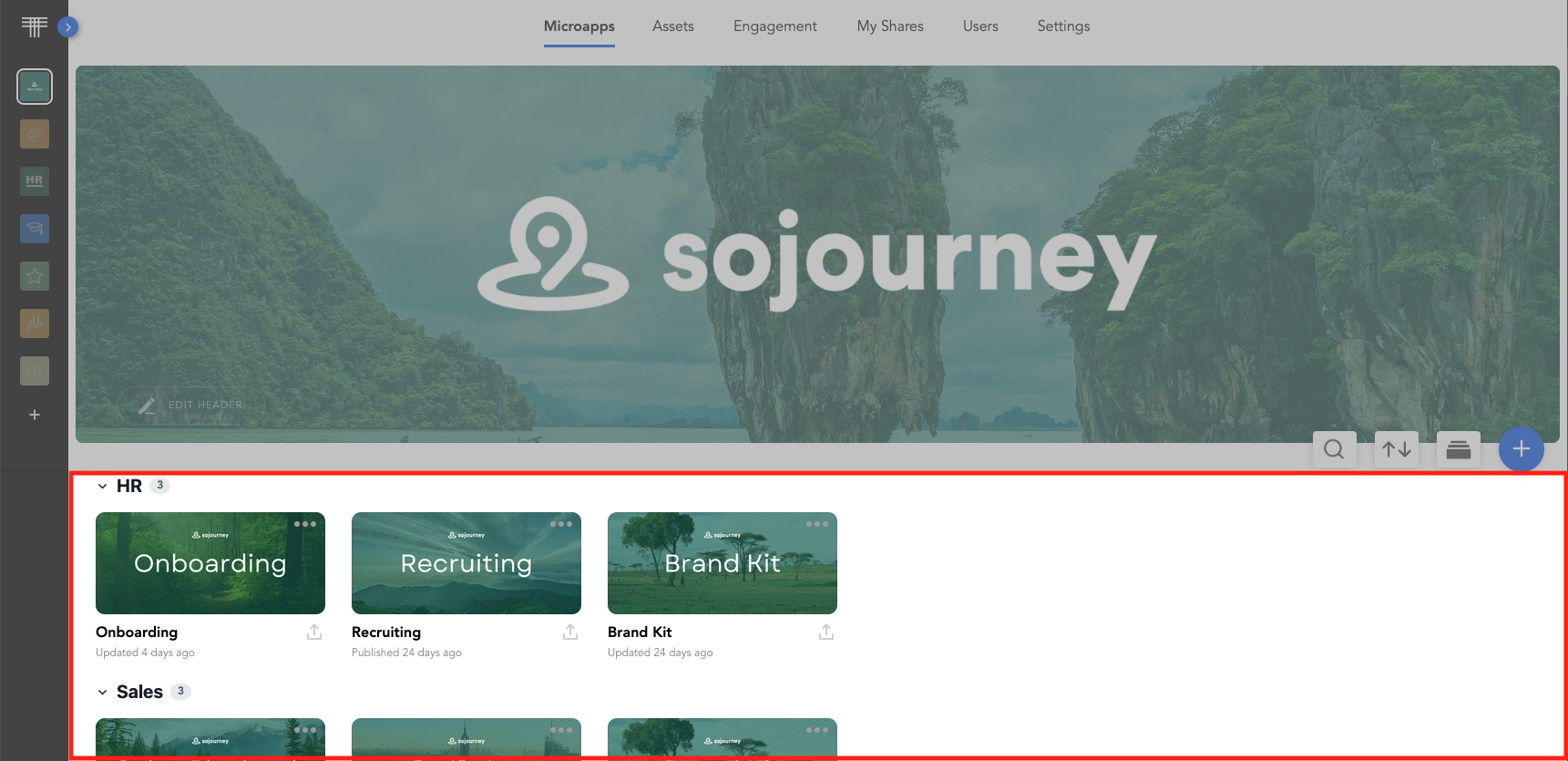
This is where the microapps in your library are displayed, allowing you to edit and manage them as needed. By default, the library is sorted into microapp categories. Any apps not given a category are placed in the Uncategorized category by default.
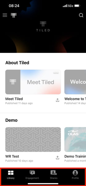
Tiled Navigation (Mobile App)
The mobile navigation bar is responsive to screen size meaning it will adjust for smaller screens. In the mobile app the navigation will look like this: