![logo-horizontal_w.png]](https://support.tiled.co/hs-fs/hubfs/logo-horizontal_w.png?height=30&name=logo-horizontal_w.png)
This article provides an overview of the components and panels in the Tiled Microapp Builder 1.0, along with helpful resources to learn how to use them effectively.
Interested in what’s new? Visit our Builder 2.0 resources to learn more about the latest capabilities, features, releases, and integrations.
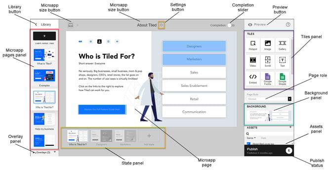
Finding Your Way Around
|
Element |
What It Does |
|
Library button (top left) |
Takes you back to your Tiled Library. Think of it as your home base. For more information about the Tiled Library page, see Navigating the Tiled Library. |
|
Microapp name (top center) |
Shows the microapp you're currently working on. Select the Settings gear icon to rename it. |
|
Pro Tip: Tiled saves your work automatically — but your viewers won't see any changes until you hit Publish. |
Building Your Pages
Microapp Pages Panel (left side)
Your page list — every page you've created appears here in order, with a snapshot and name for each. From this panel you can:
1. Add a page — select the + button. New pages are named automatically (Page 1, Page 2, and so on).
2. Rename a page — select the page name and type a new one.
3. Reorder pages — drag a page snapshot to a new position in the list.
4. Duplicate a page — open the three-dot menu and select Duplicate.
5. Convert to an overlay — open the three-dot menu and select Make into an overlay.
6. Delete a page — open the three-dot menu and select Delete.
Overlay Panel (bottom left)
Overlays are separate from your main pages — they float on top of your microapp when triggered. This panel manages them the same way the Pages Panel does: add, rename, reorder, duplicate, convert back to a normal page, or delete, using the same controls as above.
- To add a new overlay page, click the plus (+) button, and a new overlay page is added to the end of the list of microapps. Each page is automatically named Page X, where X is the page number.
- To rename the overlay page, click the name to highlight it, and enter the new name of the page.
- To move an overlay page, click the overlay snapshot and drag it to the desired location in the overlay panel.
- To duplicate an overlay page, click the three-dot button and select Duplicate. The duplicated overlay is added to the end of the list in the overlay panels.
- To convert an overlay page into a microapp page, click the three-dot button and select Make into a normal page. The page is now moved to the Microapp page panel.
- To delete an overlay page, click the three-dot button and select Delete.
Microapp size button (top left)
When you initially create your microapp, the design dimensions for the microapp pages are specified, based on the intended device used to view the microapp (Mobile, Tablet or Desktop). Clicking the Microapp Size button (located in the top left-hand side of the builder) opens the New Size window.
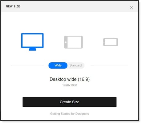
From here you can create an additional microapp size. Select the desired size and click the Create Size button.
|
Heads Up: Adding a new size does not copy your existing pages — you'll be starting fresh for that size. |
The Microapp name (located in the top center of the builder) is listed at the top of every microapp page. You can change the name by clicking the Settings button.
Settings buttonClick the Settings gear icon (highlighted in mustard yellow) to open the Microapp Settings window for your microapp.
From this window you can do the following:
- Change the general look and feel of your microapp.
- Update the security options for your microapp.
- Enable dynamic personalization options for your microapp.
- Share your microapp with other users.
For more information, see Changing your Microapp Settings.
Completion slider (top right-hand)
Click the Completion slide bar (located in the top right-hand side of the builder) to the right to specify the current microapp page as a completion event, where Tiled records that a user successfully completed viewing that specific page.
To select, move the slide bar to the right so that it becomes green. A green check mark is displayed below the thumbnail for the page in the Microapp page panel.
To deselect, move the slide bar to the left so that it becomes white. The green check mark is removed for the page in the Microapp page panel.
For more information, see Specifying a Completion Event (coming soon).
Microapp Canvas (center)
Your workspace — where you drag tiles onto the page, arrange them, and build your layout. Select any element on the canvas to select, move, edit, or delete it.
State Panel (below the canvas)
States are sub-pages attached to a specific microapp page. They let viewers access different content, triggered by a hotspot, quiz, or other interaction, without leaving the page.
All of the states for a microapp page are listed in the State panel (highlighted in yellow) beneath the Microapp page.
For more information, see Adding States to your Microapp Pages.
Configuring Your Microapp
|
Control |
What It Does |
|
Microapp Size button (top left) |
Set when you first create your microapp based on your target device: Mobile, Tablet, or Desktop. Select it to add an additional size if you need to design for multiple devices. |
|
Settings button (gear icon) |
Opens Microapp Settings, where you change the general look and feel, update security options, enable personalization, and share with other users. |
|
Completion slider (top right) |
Marks a specific page as a completion event, meaning Tiled records when a viewer reaches and finishes that page. Slide right to enable (turns green), left to disable. |
|
Preview button (top right) |
Shows exactly what your viewers will experience before you publish. |
|
Publish button (top right) |
Pushes your changes live and makes them visible to your audience. |
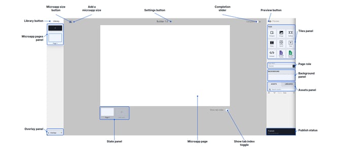
Tiles panel
The Tiles panel (highlighted in violet) displays all of the tiles that you can use with your microapp page.
| Tile | Description |
| Hotspot | Create a clickable area that links to pages, URLs, files, phone numbers, or emails. |
| Image | Place a photo or graphic on your page. |
| Carousel | Let viewers browse a collection of images without leaving the page. |
| Video | Place a video asset directly on your page. |
| Scroll | Create content that extends beyond the page edge, scrolling vertically or horizontally. |
| Text | Add custom text directly onto your page. |
| Embed | Embed another microapp or external resource. |
| Google Forms/ Google Sheets | Embed a Google Form or Sheet directly into your page. |
| Quiz | Allows you to create a multi-question quiz within your microapp that you can use to confirm participation or test your viewers. |
| Script | Drop an HTML script directly onto a page. |
|
Try It Yourself: Open a test microapp and click through every panel mentioned above — Pages, Overlays, State, Tiles, Background, and Assets — just to see where each one lives. Five minutes now saves you a lot of hunting later. |
.png?width=670&height=580&name=tiled-tiles-panel-callouts%20(1).png) Page Role
Page Role
The Page Role list (on the right-hand side of the builder in the center) allows you to change the role of your microapp page. Tiled has defined three roles for microapp pages:
- Normal
- State
- Overlay
You can click the drop-down list and select the desired new role for your page.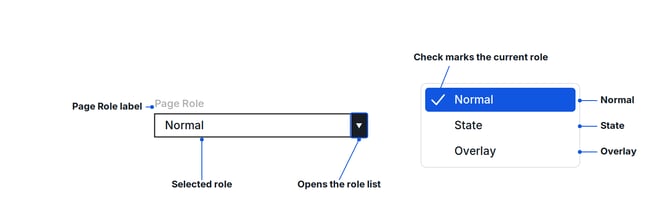
Background panel
The Background panel (highlighted in green) allows you to easily designate an image or video asset as the background of the microapp page. Drag the desired asset from the Asset panel to the Background panel to set it as your background. For more information, see How to set a Background.
Assets panel
The Assets panel (located in the bottom right-hand side of the builder) lists all of the assets that you have imported to the microapp. These assets can be used on any page, state, or overlay for any version (i.e., size) of your microapp. For more information, see Adding Assets to your Microapp.
Removing an Asset From Your Microapp
When you delete an asset from the Assets Panel, it no longer appears in your microapp — so it's worth double-checking before you confirm.
Delete the asset — select it in the Assets Panel and press Delete, or right-click and choose Remove.
Undo if needed — press Ctrl+Z (Windows) or ⌘Z (Mac) right away to bring it back instantly.
|
Pro Tip: Get in the habit of using undo right away if something disappears unexpectedly — it's your fastest recovery tool. |
Publish button
Click the Publish button (located in the right-hand corner of the builder) to open the Publish to Groups window which allows you to publish the microapp.
Learn more about Builder 2.0
Looking for Builder 2.0? Visit our Builder 2.0 resources to explore the latest capabilities, features, releases, and integrations.