![logo-horizontal_w.png]](https://support.tiled.co/hs-fs/hubfs/logo-horizontal_w.png?height=30&name=logo-horizontal_w.png)
The General Settings of your microapp will allow you to adjust some of the most important information about your microapp, especially how your microapp appears to others.
Accessing Microapp Settings: General
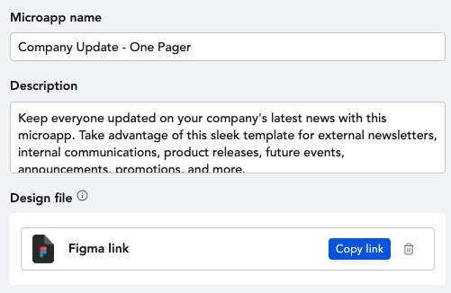
Microapp name
The title of your microapp will be visible in the Tiled Library, as well as any time you share your microapp. NOTE: Not all browsers support emoji's so be conscious that the name of your microapp is accurate and descriptive of your content.
Description
Add a description of your microapp for Library users to see. The description is only visible in the Microapp Settings at this time. Future improvements are coming to Tiled to reveal this information from the Library.
Design File
This section allows you to associate your microapp with a Figma, Adobe XD or Sketch file. Associating your microapp with its design file is considered best practice, so that other team members have access to the design file and to provide a central location for the most up-to-date designs. You do not have to add a design file to create a microapp.
Appearance
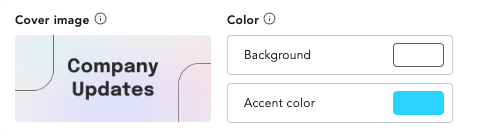
Adding a cover image to your microapp will make it easier to navigate your microapp library and will add basic meta data to your microapp so an image appears when shared over social channels.
Set a cover image
- Click on the gear icon at the top of your microapp.
- Once you're inside the editor, click the gear icon in the top left corner
- In the window that opens, you'll see an area where you can drop your cover image in
- You can specifically design your cover image to be 504px x 224px.
- Option to also drag over an asset into the cover image box as well
Background and accent color
Background and Accent color allow you to quickly build a microapp and use colors that are frequently used across your microapp design.
The Background Color is a global attribute of your microapp that controls the color of your pages, page states and overlays. The default background color is set to white (#000). Since it is a Global attribute, updating your background color at any time will update the color of all of your pages, page states, and overlays.
Although less common than the background color, the Accent Color is an attribute that allows you to select a secondary color which can be used in other places across your microapp, such as the color for the slider controls in a Gallery Tile.
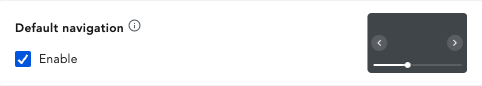
Default Navigation
Enable the Default navigation, to show left and right navigation arrows to your microapp. This is especially helpful if you are starting from a PDF and need a way to navigate between microapp pages.
Custom buttons
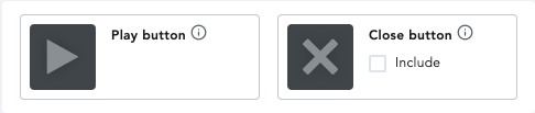
Every microapp has a pre-set Play button and Close button.
The Play Button will appear on any videos from your asset library when a video is paused. The video icon will not show on Video URLs, like Youtube links.
The Close Button will appear in the top left corner of Overlay Pages by default. You can hide this icon by unchecking the box.
You can customize your own Play and Close buttons by uploading image from your assets library and dragging them into the images in your General Settings.
Adaptive format
Change the size of the microapp by selecting the format and orientation.

Modifying the dimensions of your microapp should be done before building your microapp. Images and tiles that are present on microapp pages will be resized if a different format is selected. The layout of your Tiles may be irreversibly affected after choosing a new format.
Swipe behavior
Swipe behavior controls the transitions of microapp pages when viewing a microapp on a tablet or mobile device from the Tiled app. Microapps with gallery, embed, or custom tiles will not be impacted by modifying this setting. The available swipe options are:
- Slide
- Jump
- Do Nothing
Completion duration
The Completion field allows you to create a completion event for viewers who view a microapp for a specific duration. Completion Events can be triggered after sessions that last:
- 5 min
- 10 min
- 20 min